
_
Client: The Oaxaca Learning Center (TOLC)
Art Direction: Mireya Ramirez
Scope: Brand Identity, Logo Design
The Oaxaca Learning Center (TOLC) provides much-needed academic tutoring and social service support to low-income students from underserved urban neighborhoods and indigenous rural villages throughout the state of Oaxaca, Mexico.
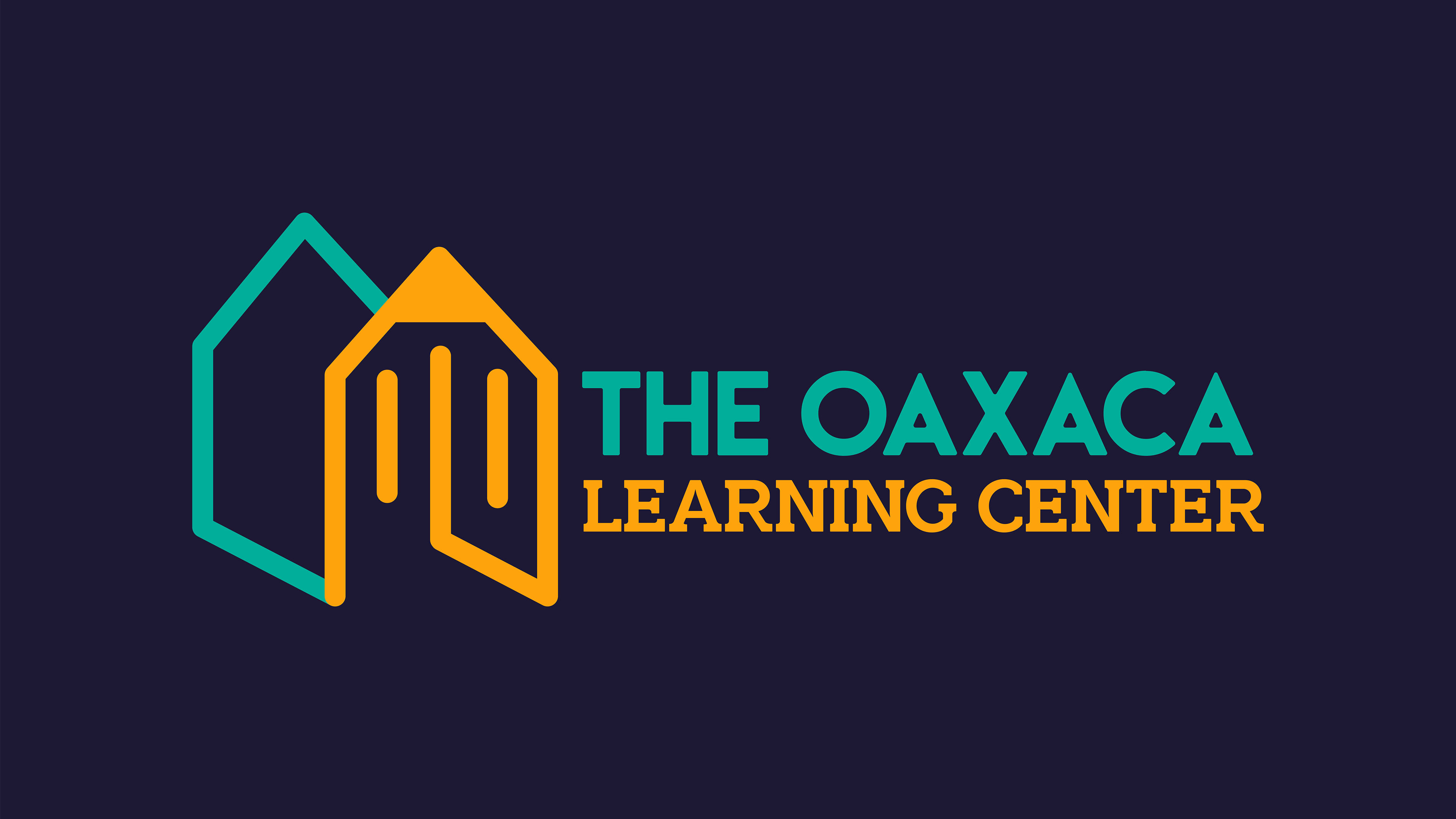
The logo was crafted with the intent of symbolizing not just an educational learning center but also portraying it as a nurturing home, dedicated to fostering the success of every child in its care. The choice of colors was deliberate, mirroring the vibrancy of the city and working harmoniously to cultivate a lively and welcoming ambiance.
The Inspiration
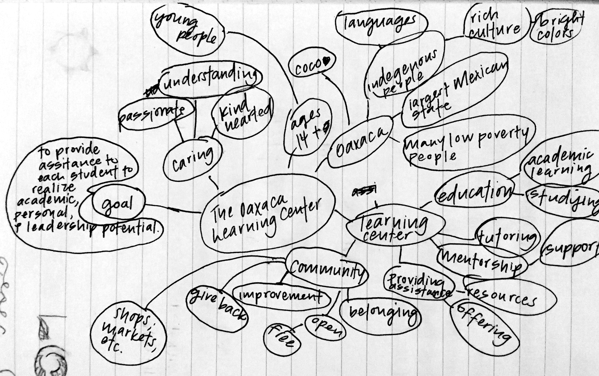
Mind Map
The Exploration
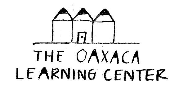

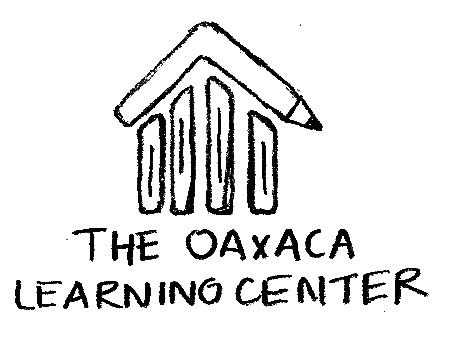

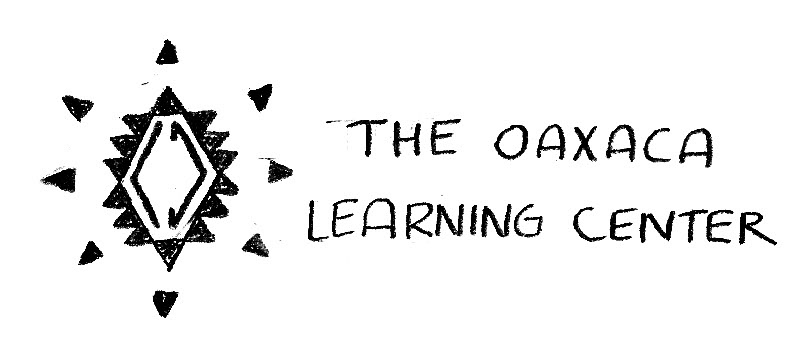
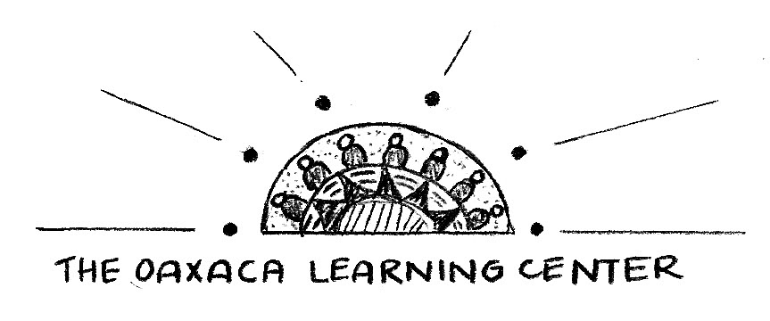
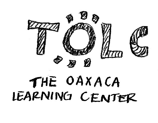

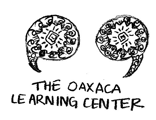
Initial Logo Sketches

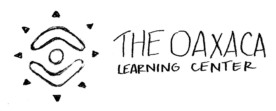
Finalized Logo
The Colors & Typography

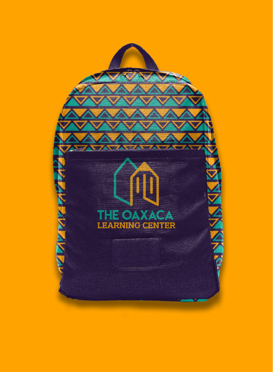
The Implementation